When people see one of my abstract/surreal images, they often ask ‘How did you do that?’
Details
Personal Challenge
Categories
Image Manipulation (no AI)
When people see one of my abstract/surreal images, they often ask ‘How did you do that?’
In this post I unpack some detail about the process of creating one of my Photoshop Creative readers’ competition entries. This is not a tutorial, but rather I’ll show you some key points in the process of generating this artwork. This image was not generated using any AI, and was crafted using Photoshop before AI was readily available.
Background
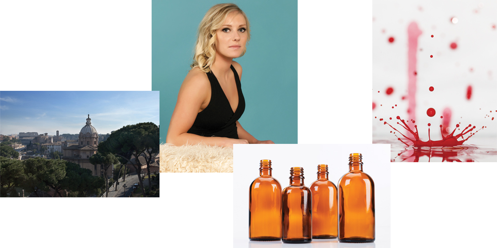
Each month Photoshop Creative magazine held a competition for readers. In this case the challenge was to take four randomly supplied pictures and turn those four images into a creative piece of artwork. You could use or add your own images if you like, and you didn’t have to use all the images. However, I preferred to set myself the challenge of trying to combine just all four images supplied and manipulate them in some way to make a new image that makes sense.
The original images
Below are the four originals that were supplied – this shows you the entire image area that was available:
1. The first stage
I spent some time considering how best to use the images, their quality, size, subject matter so I could consider how I could combine them to make something that worked. I did a couple of very quick line sketches of various ideas. Some worked, and some didn’t, so I decided on an idea that made some sort of sense of the images in real-life when combined.
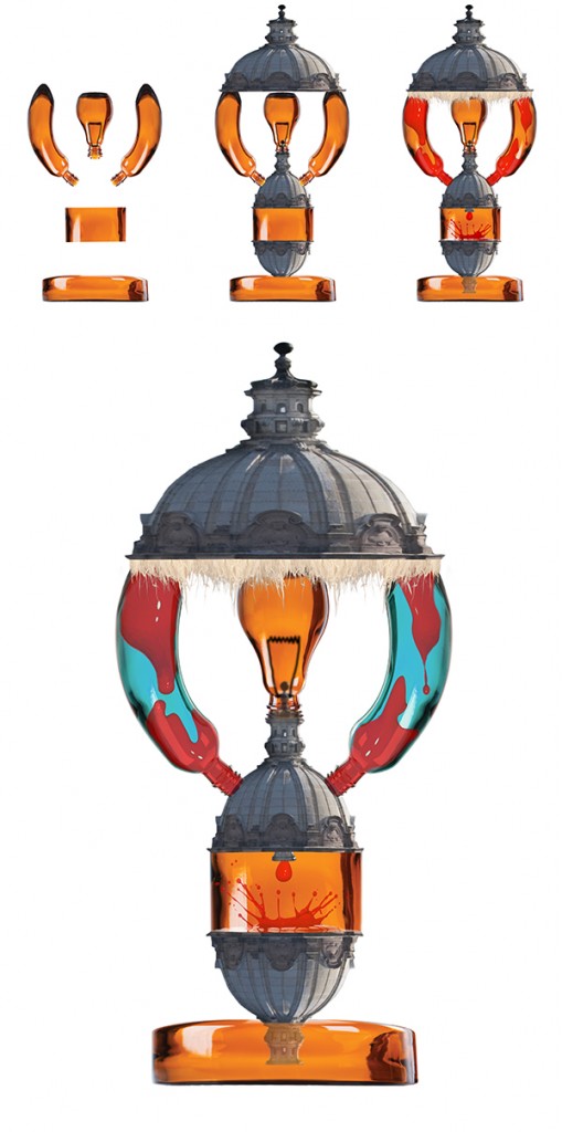
I settled on creating an image centred around the idea of a still-life photograph in an Art Deco style. The model’s expression lends itself to a still life idea (even though many still life images don’t include people), and I had an idea that the dome in the Rome photo could become an Art Deco lamp shade and the bottles could be used to make the lava lamp along with the splash image. The lamp could then be in the foreground of the image, and I could have fun with working out the lighting and shadows to make the image dramatic.
2. Getting started
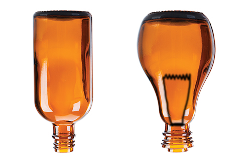
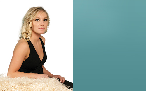
So the usual first task is to begin isolating the elements in the images. In this case, I needed to isolate the model from the background, and one bottle. The first thing I did with the isolated bottle was create the lightbulb for the lamp (see below).
At this point I quickly experimented with some rough alternative concepts/ideas and textures…
3. Building the Art Deco lava lamp
The next stage was to create the complete image of the Art Deco lava lamp. I did this by duplicating and manipulating the glass bottle into the shapes I needed using various tools including scale, distort and warp to make the lamp shape work properly and help it look like an Art Deco inspired lamp. I added a finishing touch of a cutout of the fur on the edge of the shade to help give the right feel. The hardest image to incorporate was the splash image, but I worked out that I could arrange everything in the lamp to form a ‘flow’ downwards with a drip and splash at the bottom. I created all the lava ‘blobs’ and the drip from the splash image.
4. Visualisation of the final image
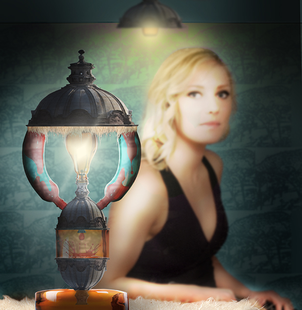
I decided to use all the elements I have created so for to produce a rough of the final image to check that it will work in terms of composition, lighting, background etc. I didn’t want to do too much work only to be unhappy with the result. Below is the rough, and you’ll see further down that I changed a few things for the final version.
5. Adjustments and changes
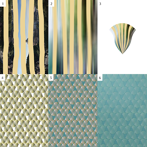
Having satisfied myself that in principle the image will work, I realised that I still needed a few elements. In particular, I wanted to enhance the Art Deco feel in the image. I decided a good way to do this would be to add an Art Deco style wallpaper in the background. To make this from one of the images supplied I used several stages – the pictures below show a few of the stages in the process. I started off using the Rome photograph and simply adding some bold vertical lines (1) before blurring everything in one direction (2) then using the warp tool (3) to create a shape I could repeat. (4) I then blended the repeated shapes into the background colour which I’d isolated from the model image earlier and applying a couple of filters including a stroke (5, 6).
6. Manually adding the shadows and light
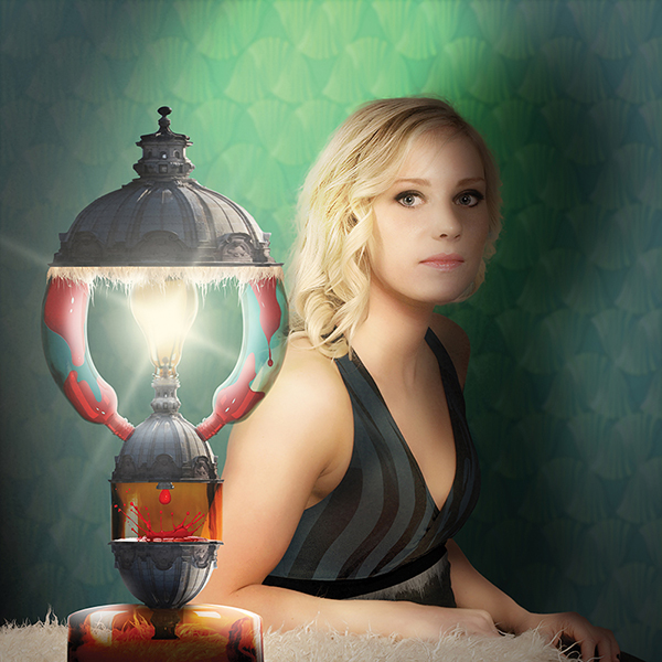
For me this is the most fun and key stage in the process of an image. Below you can see a very simple set of pictures that show the shadows and light building on the image. This takes it from a very flat image where all the elements have simply been dropped in place (1) gradually building the lighting and shadows on the background (2), the model (3) and the lamp (4). Of course, I wouldn’t build the shadows in such an ordered way – rather they would evolve as I imagine how the light and shadows would fall in the scene overall.
7. The final stage
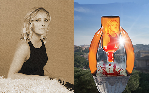
Once all the manipulation was done, I did try adding some vintage filters including the version I’ve shown below.
8. Here is the chosen image…
More Projects
Let's Start Something new
Say Hello!
If you have just found me via a search, or someone has recommended me, I would love it if you could tell me a little about your vision or business and how you would like me to help you. You can also use this form to make a general enquiry about my services or ask me a question.
